Wolfepack Advantage came to us needing a brand that finally matched the caliber of the work they do — a fractional CFO practice built for growth-minded owners who need more than bookkeeping but aren't ready to hire a full-time finance leader. The old identity did not carry that story.
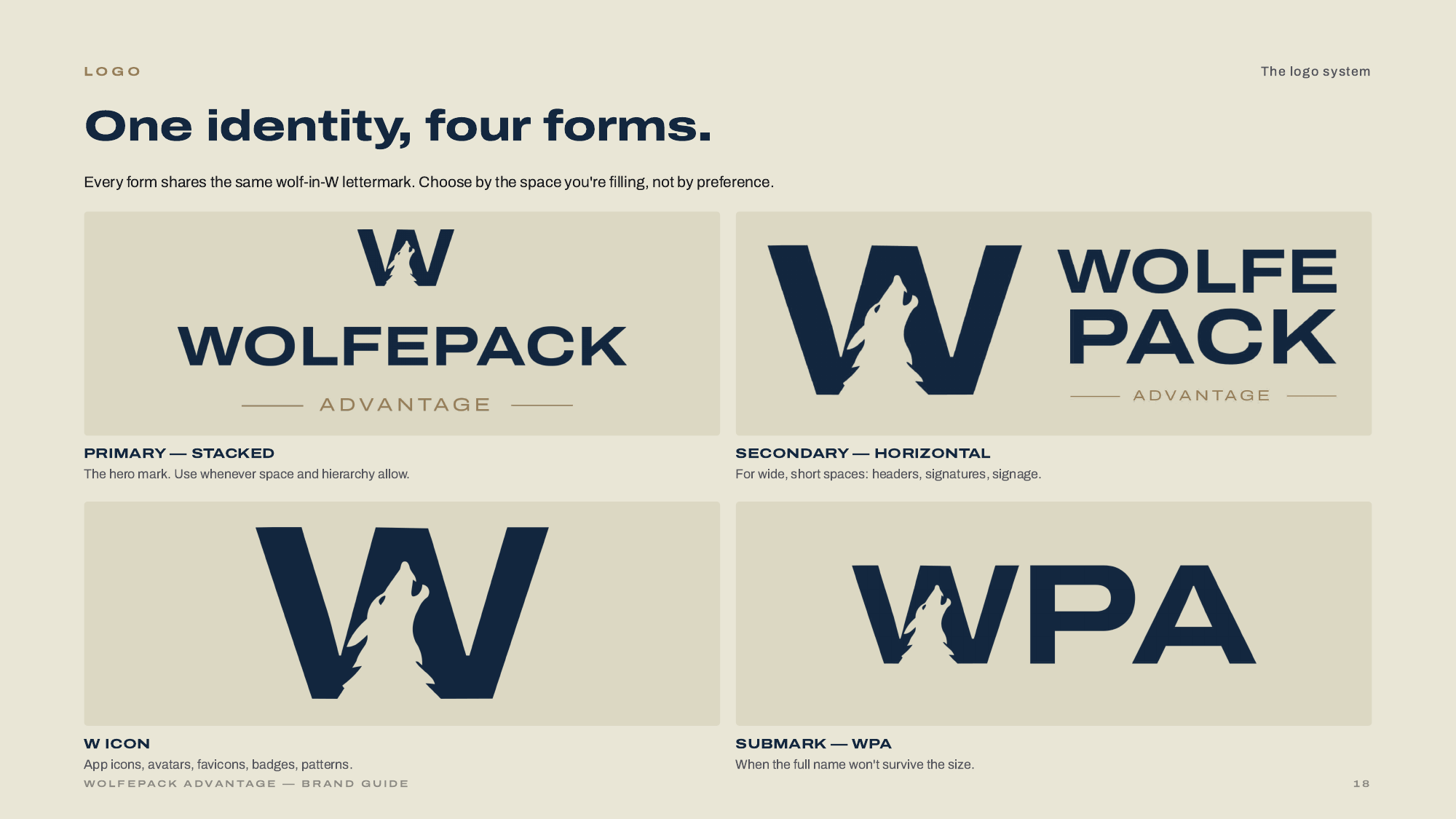
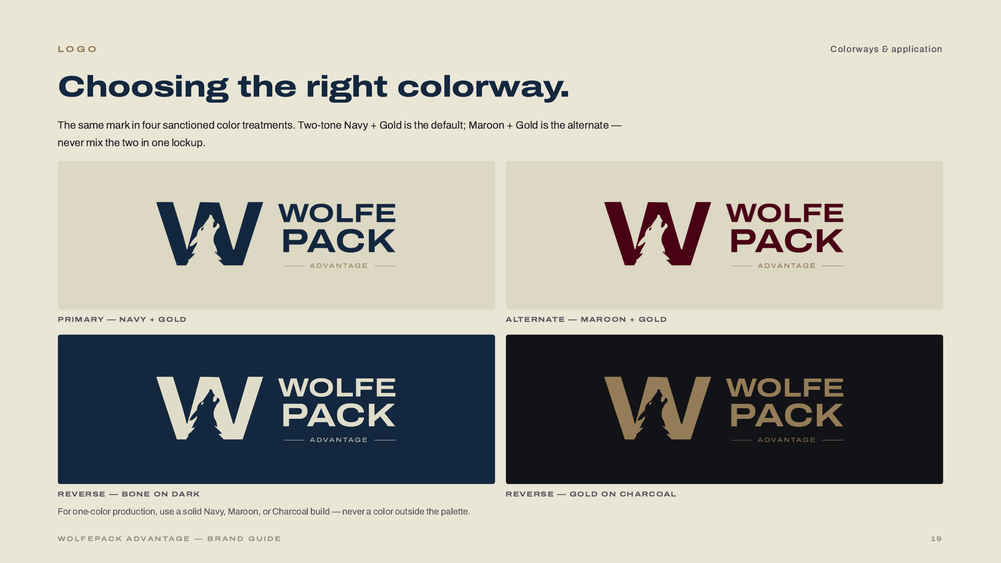
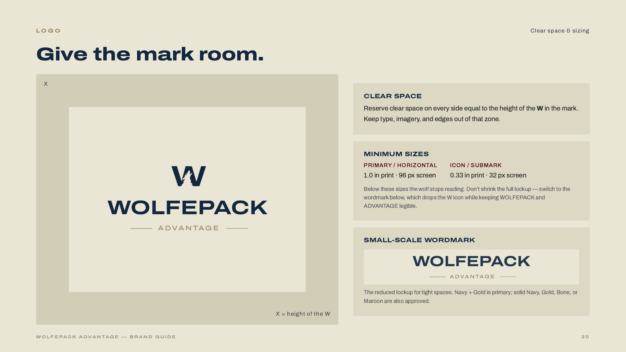
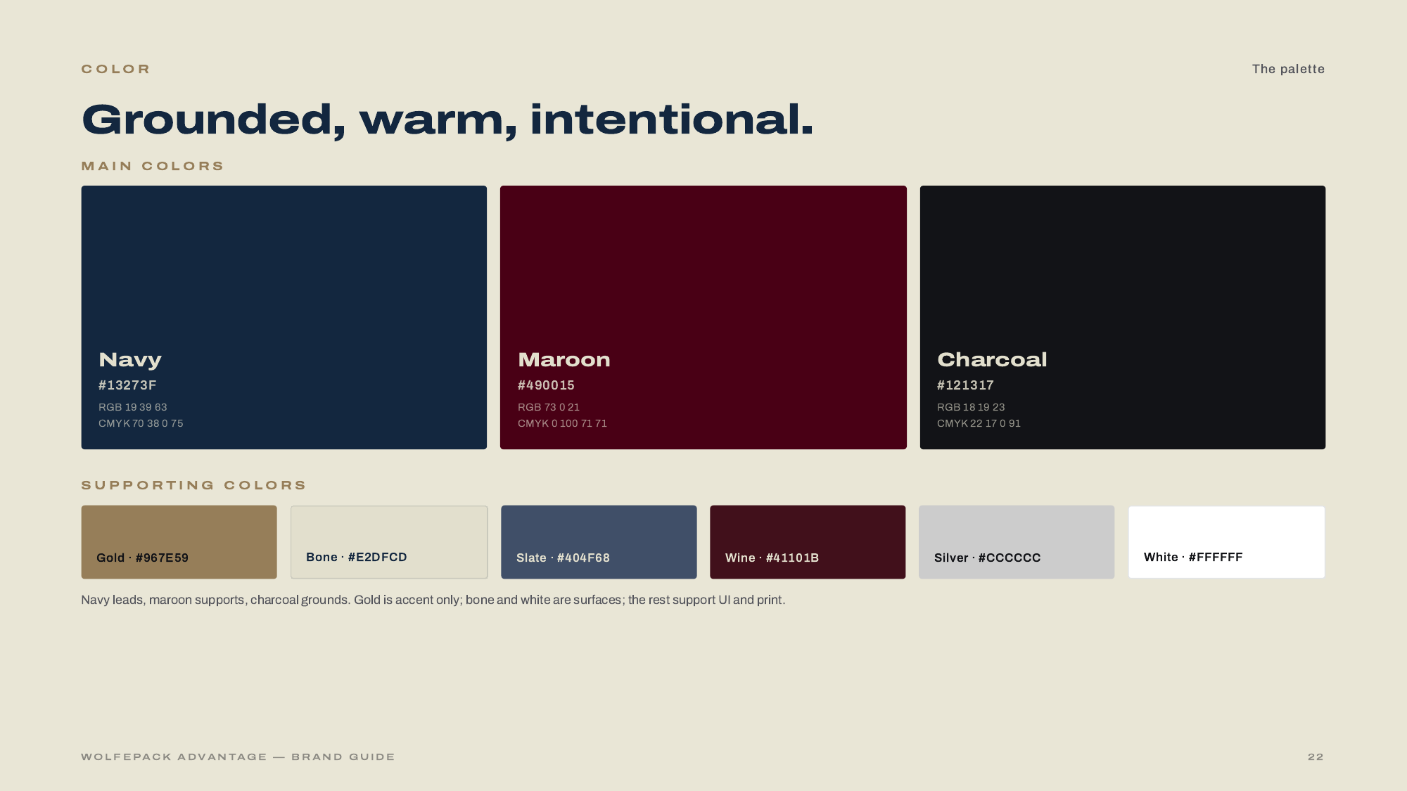
The engagement covered both halves of the brand — the strategic foundation (naming rationale, positioning, mission and vision, tone of voice, vocabulary) and the visual system (a refined wolf-in-W lockup, four sanctioned lockup forms, a grounded navy-and-maroon palette with a warm bone surface, and the Archivo type family in two widths). The rebuild extended to the website — a full redesign and development pass that pulled every touchpoint into the same voice and posture.
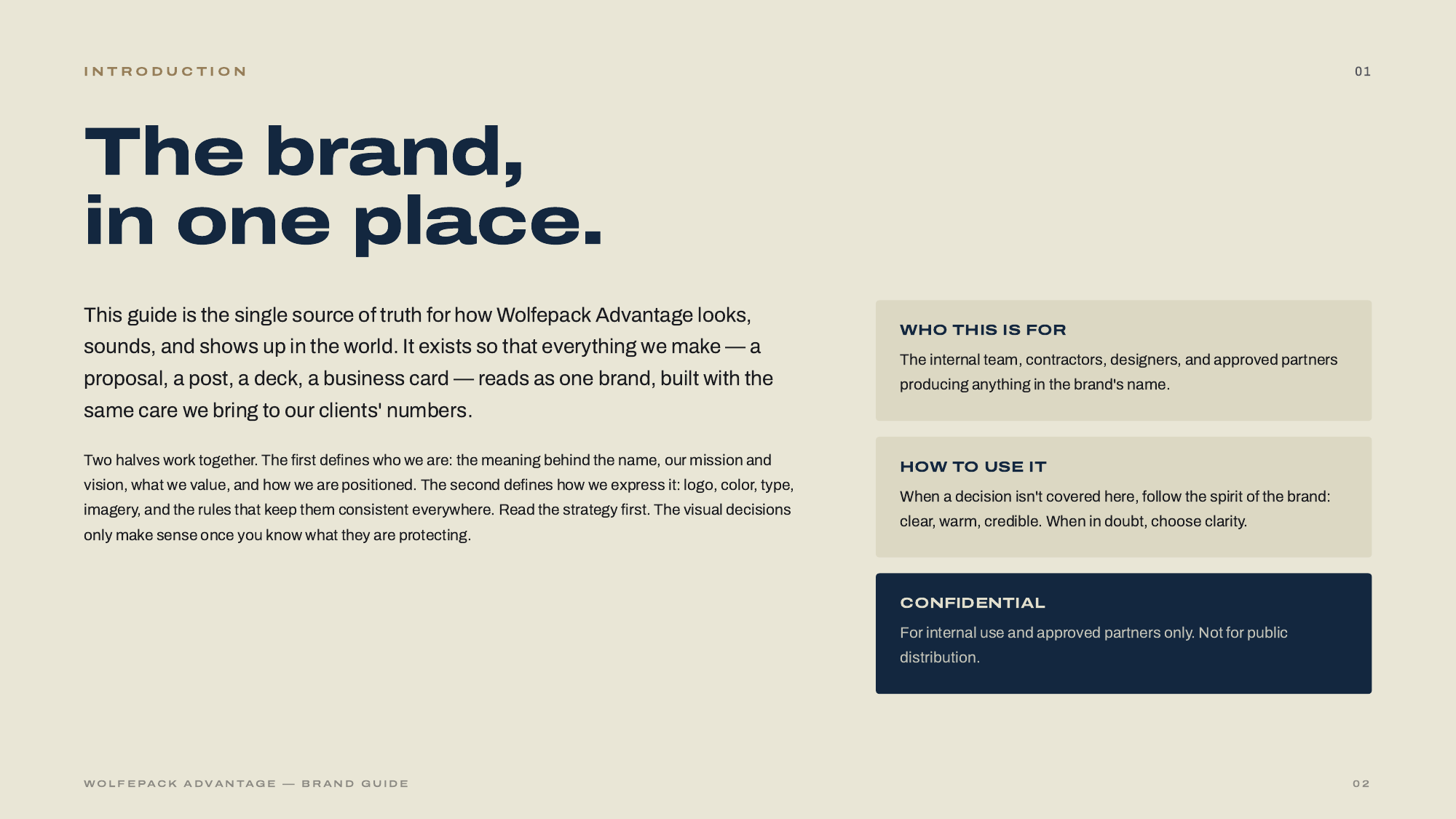
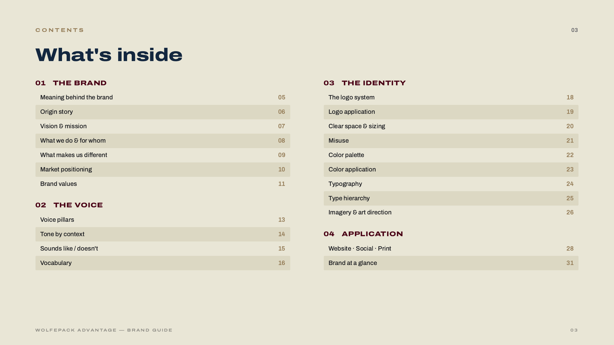
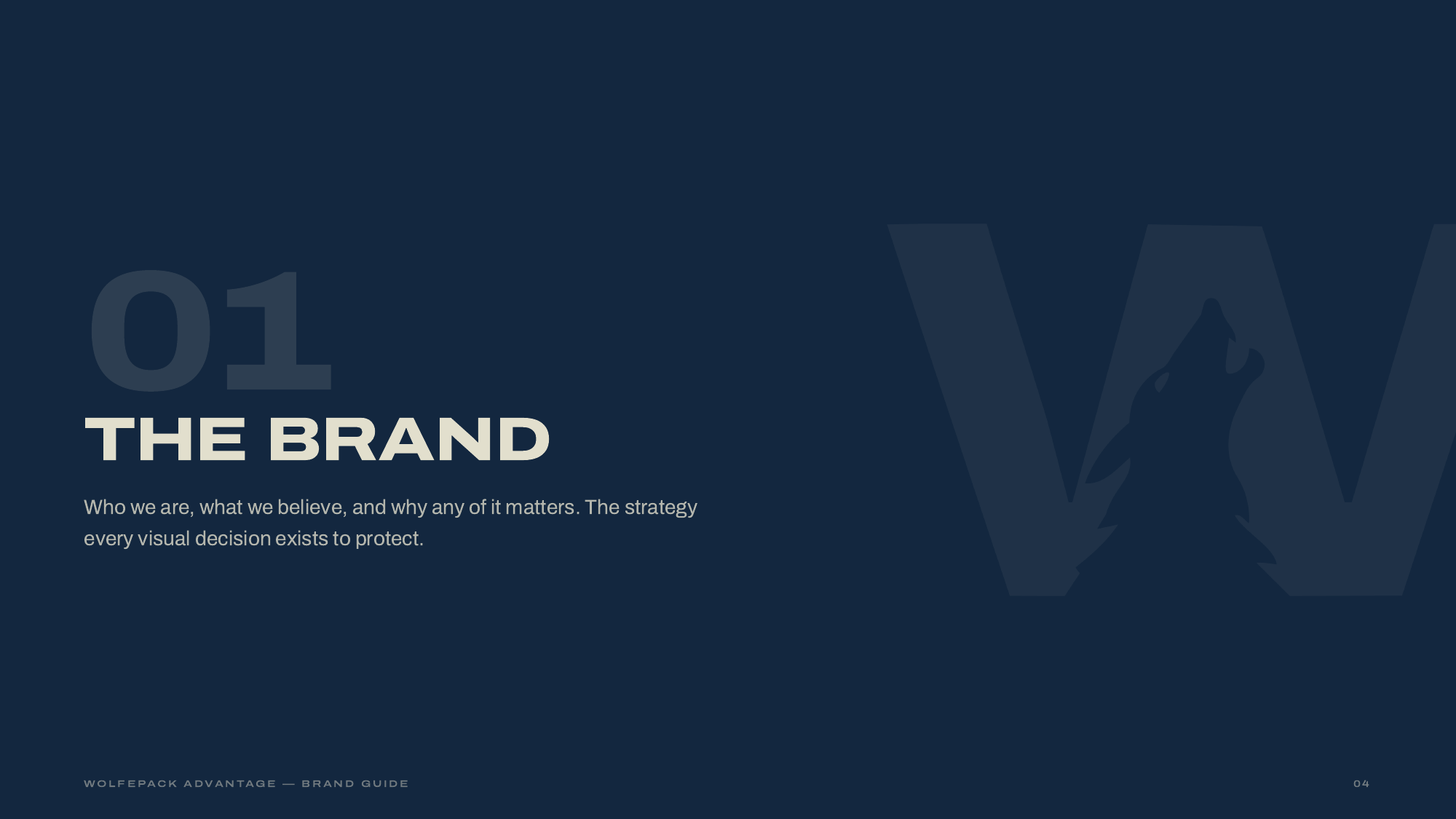
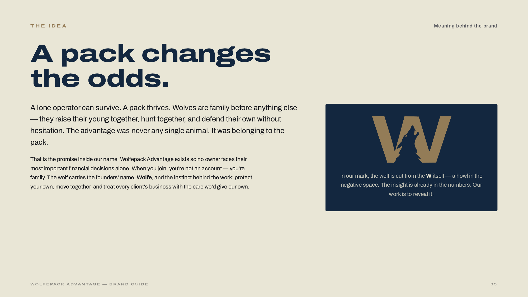
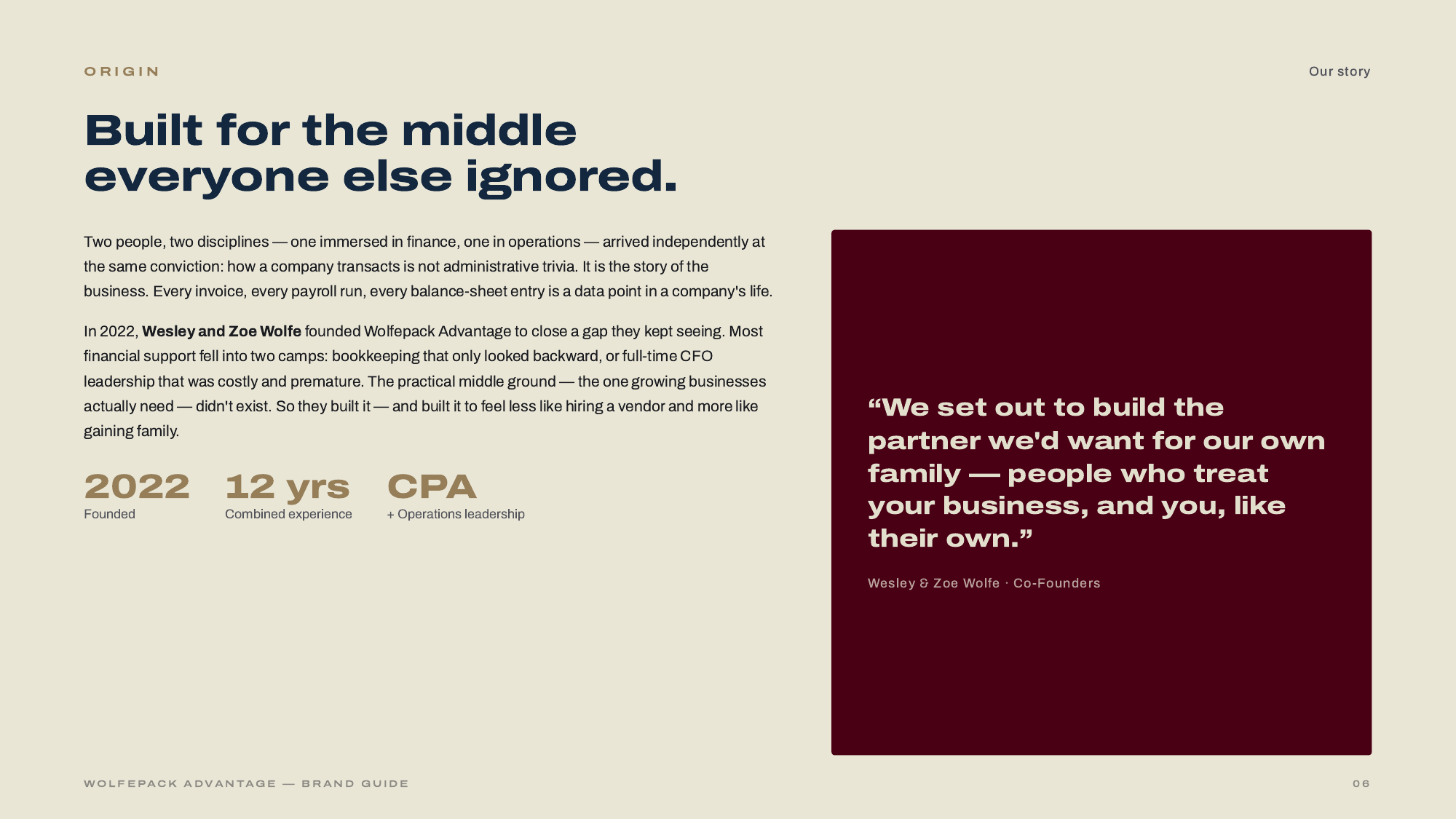
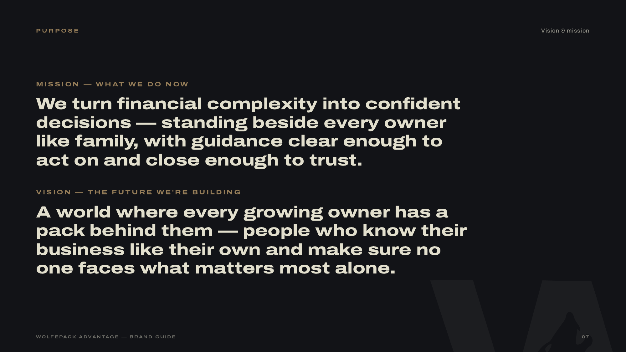
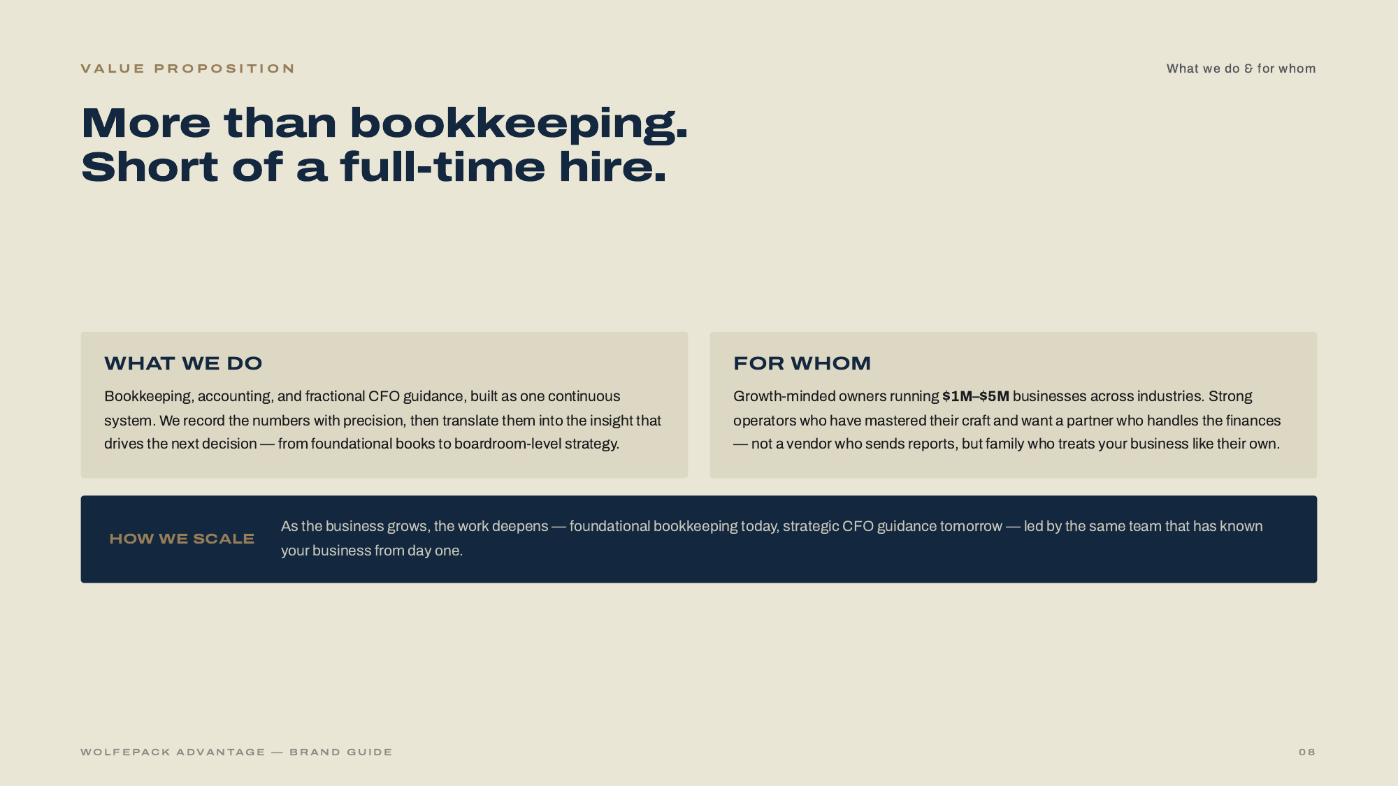
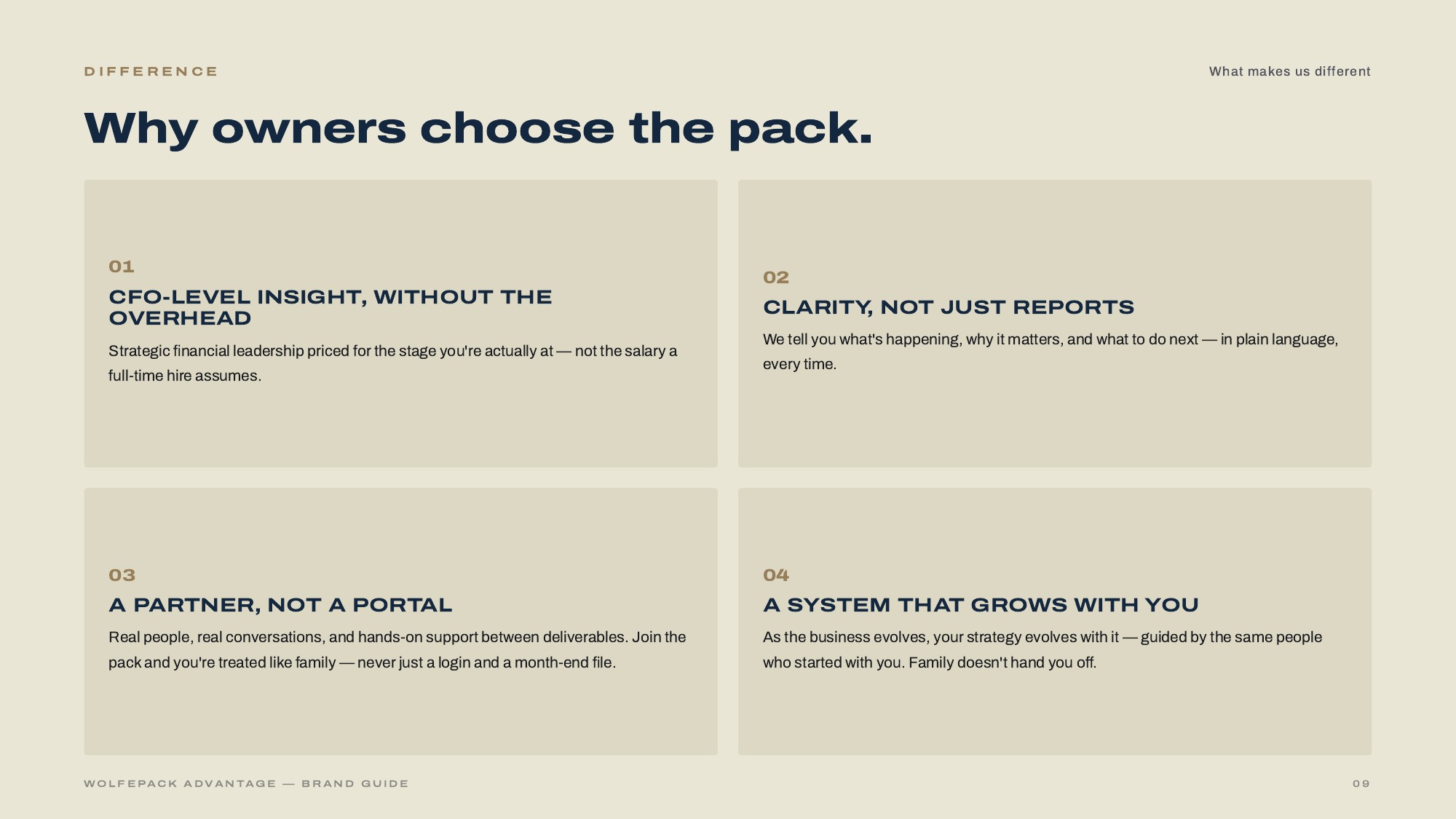
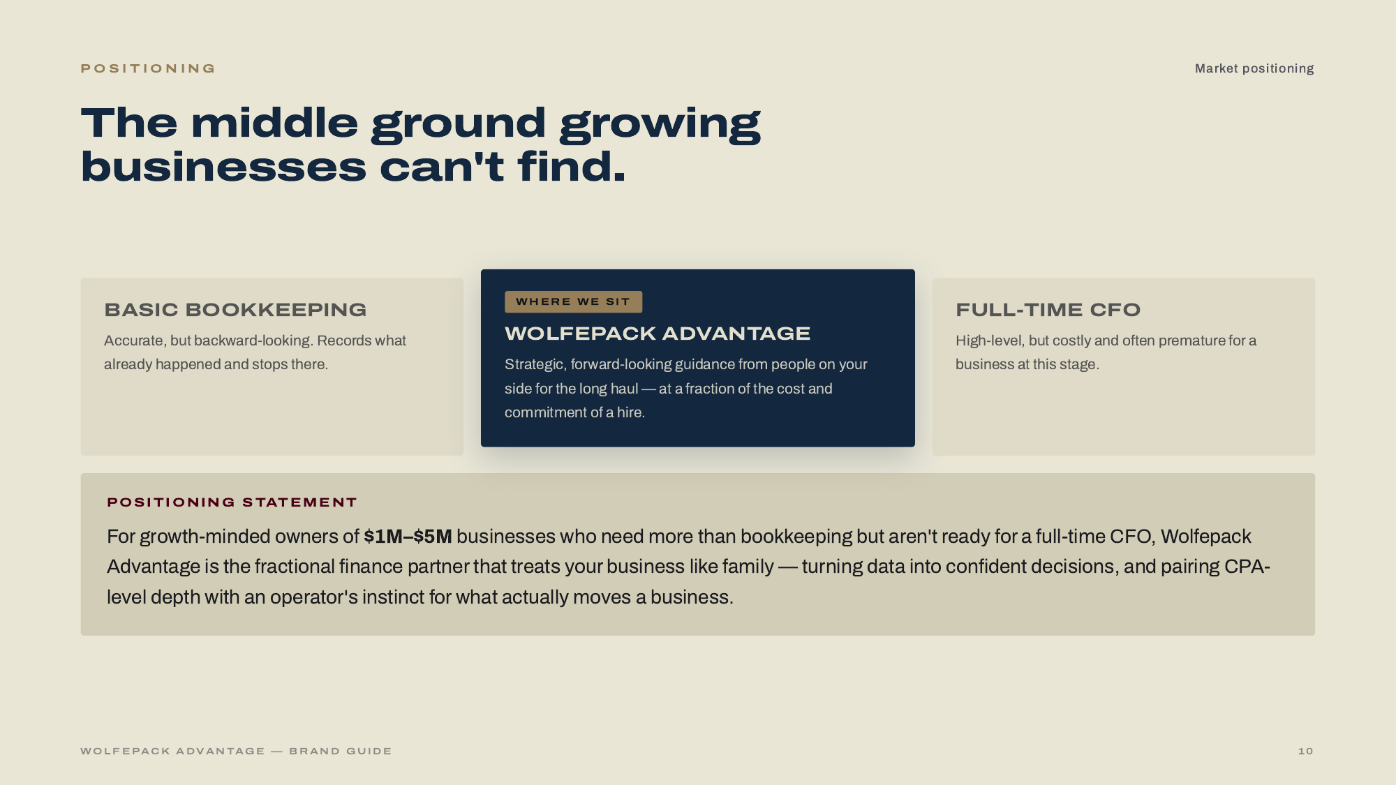
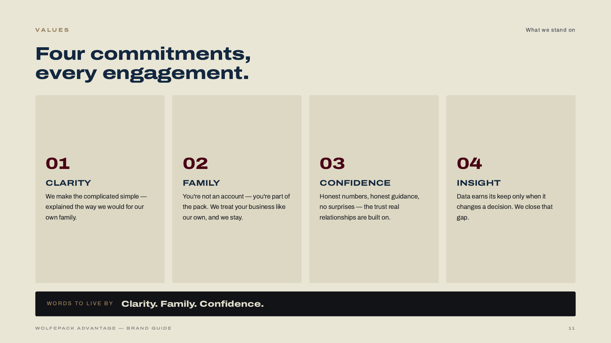
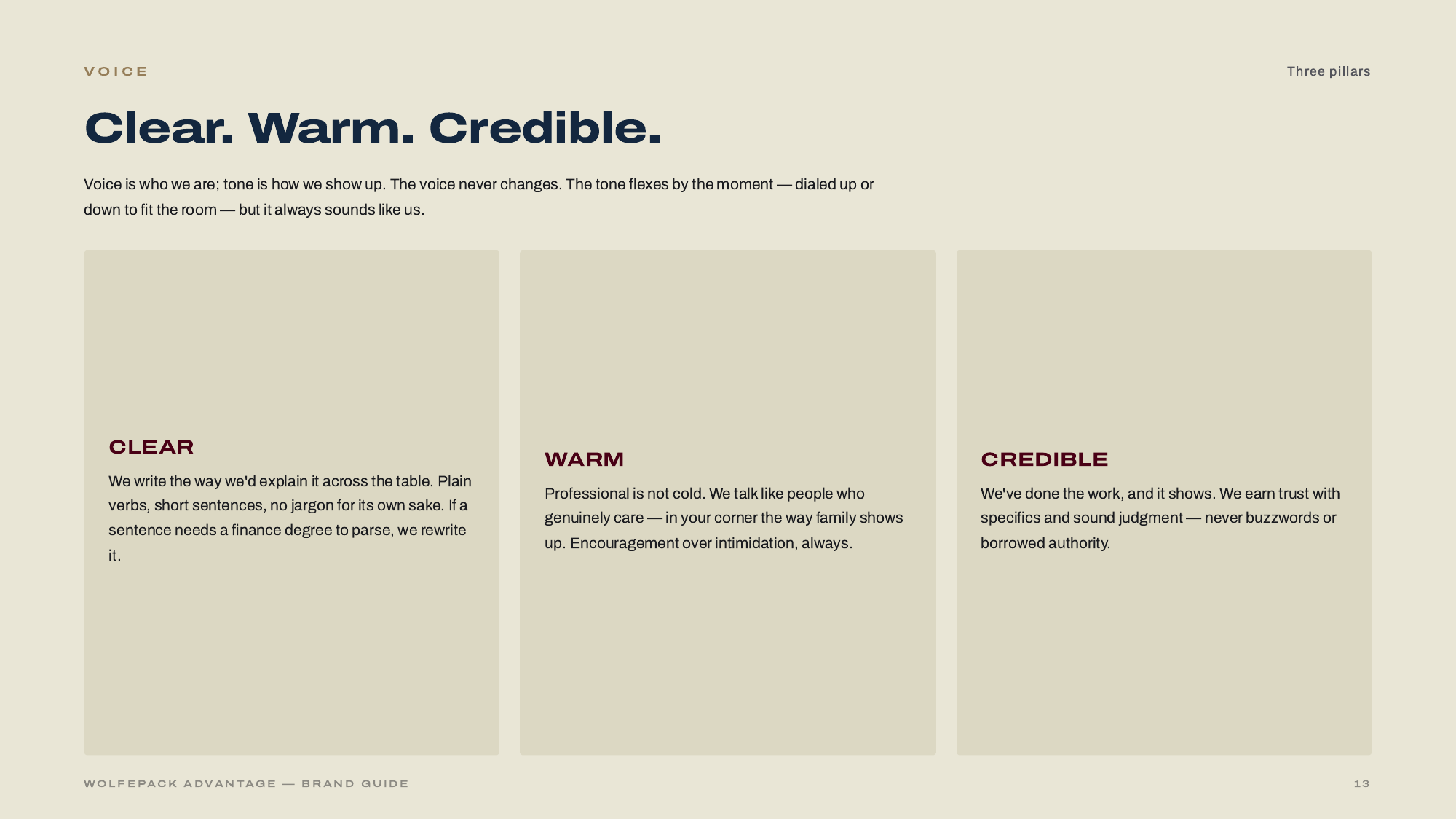
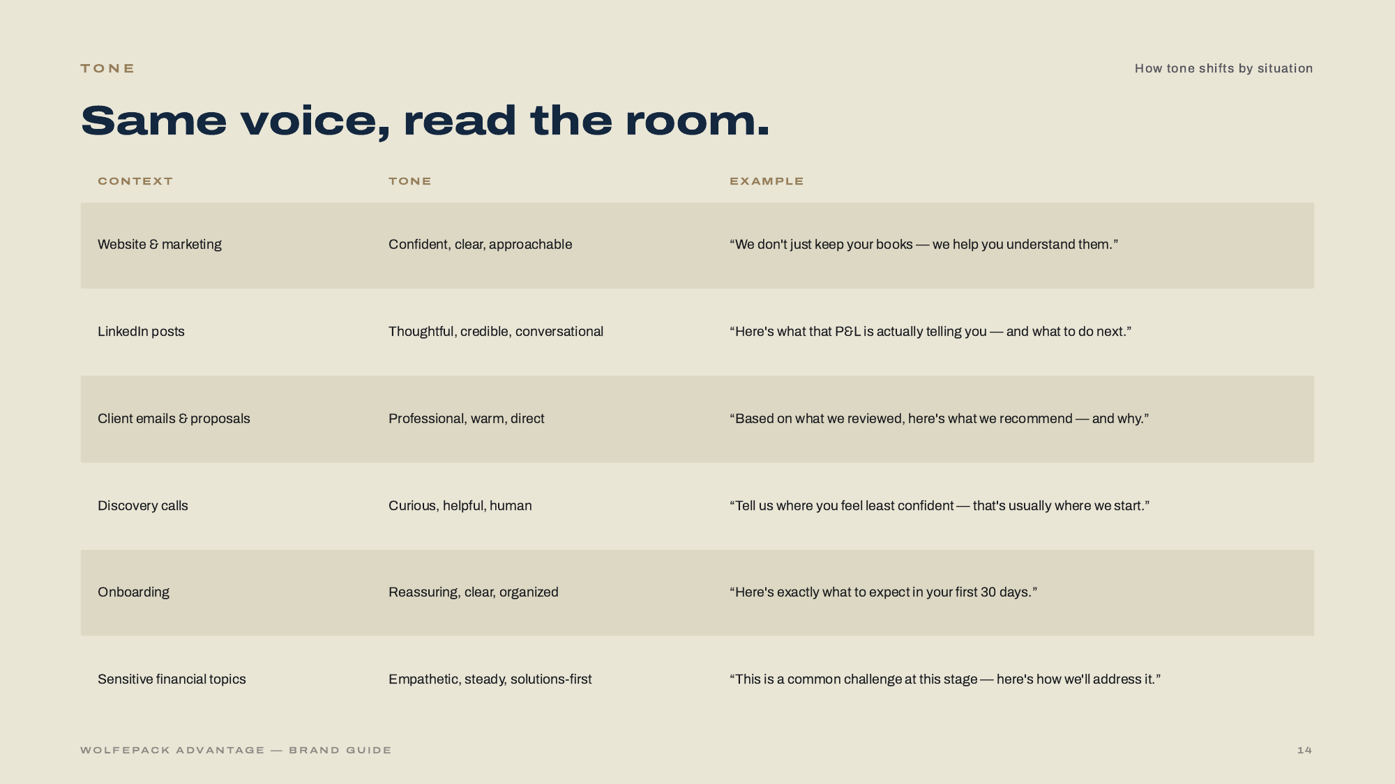
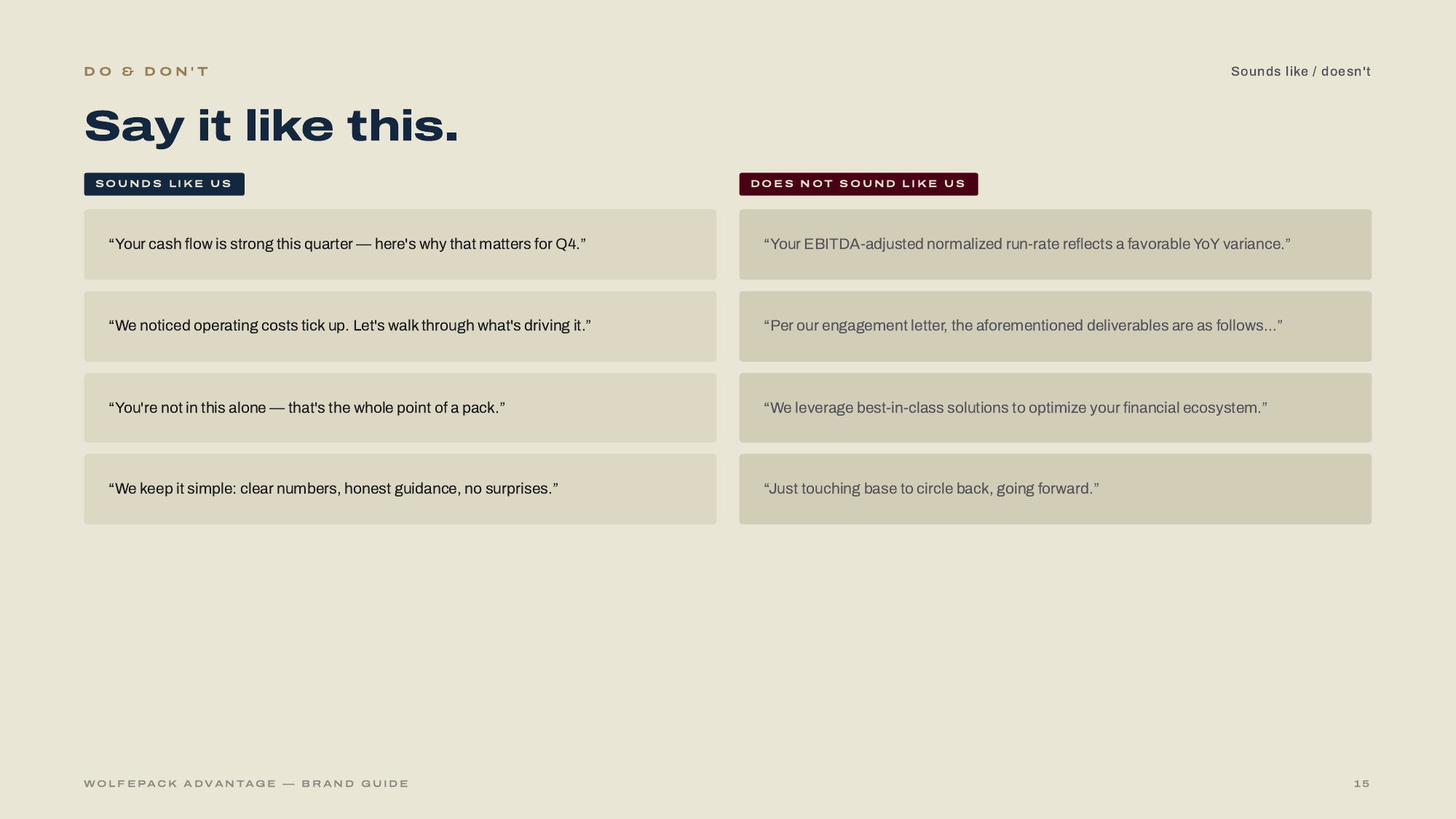
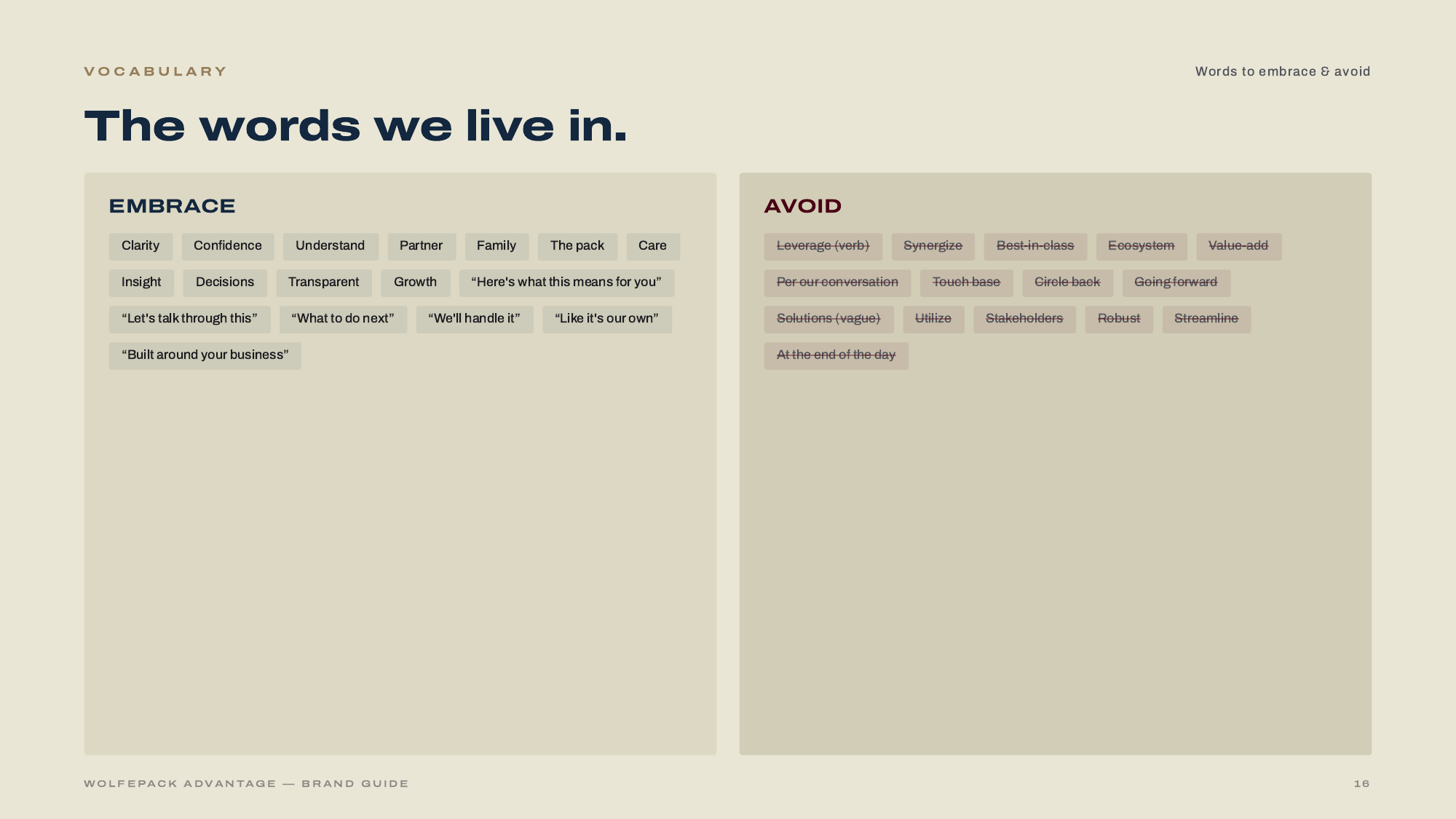
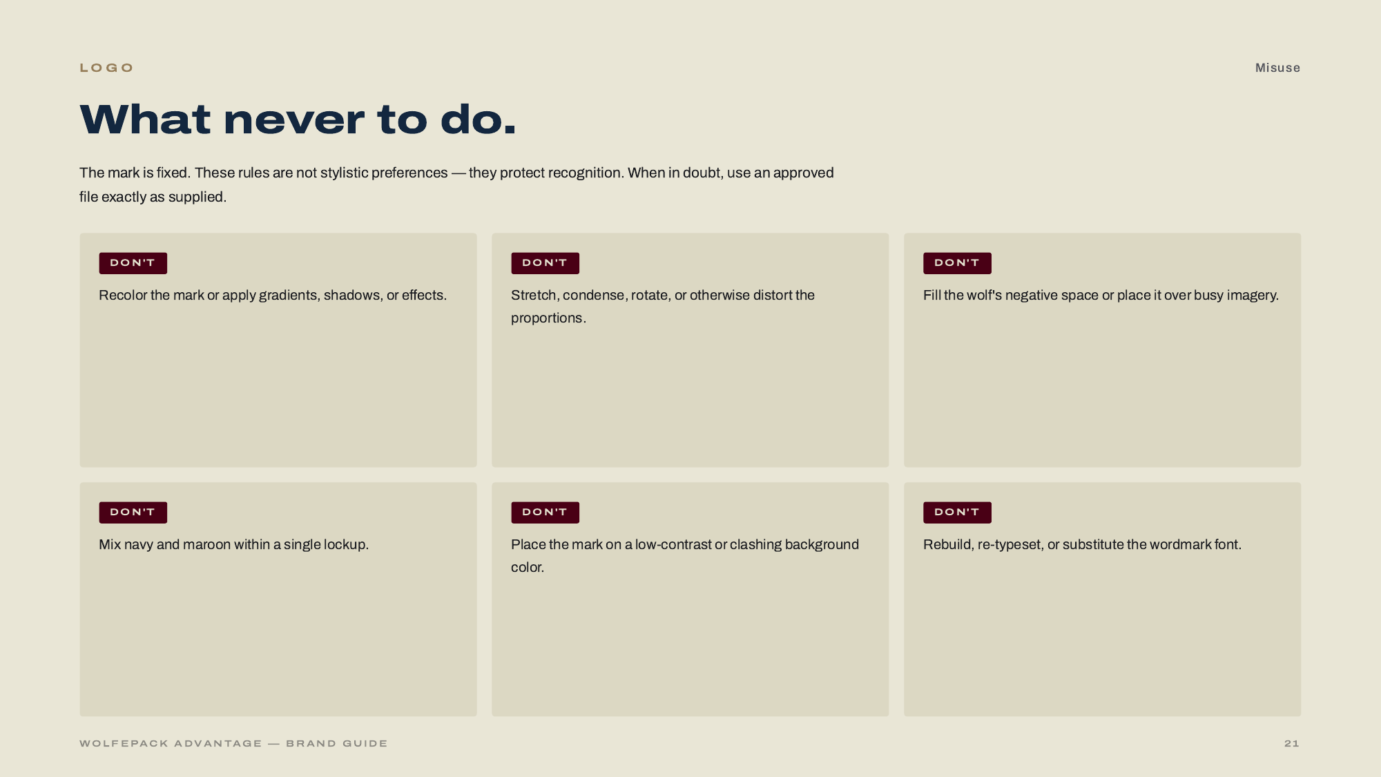
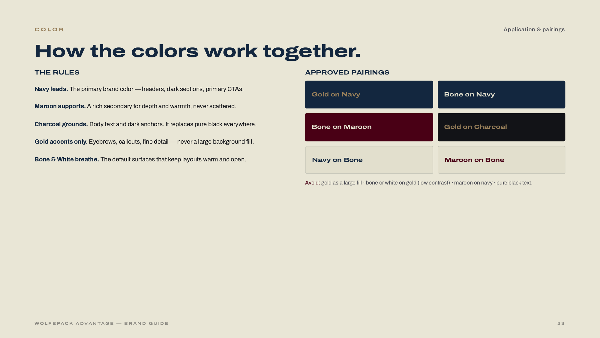
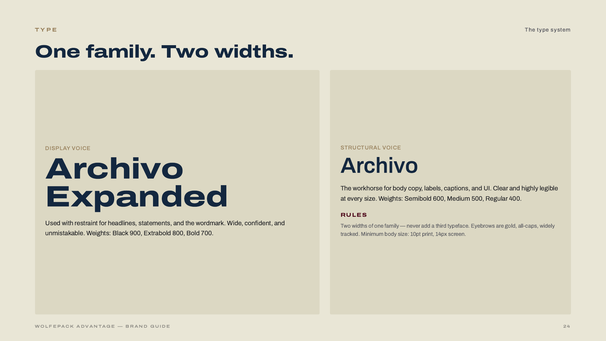
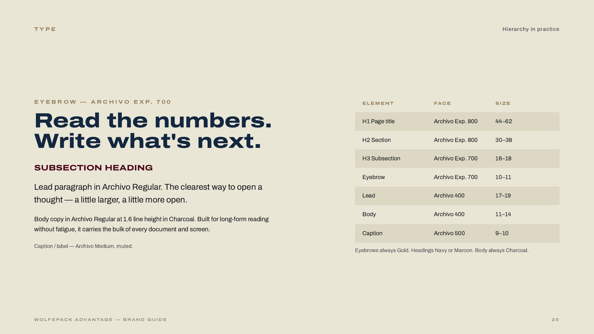
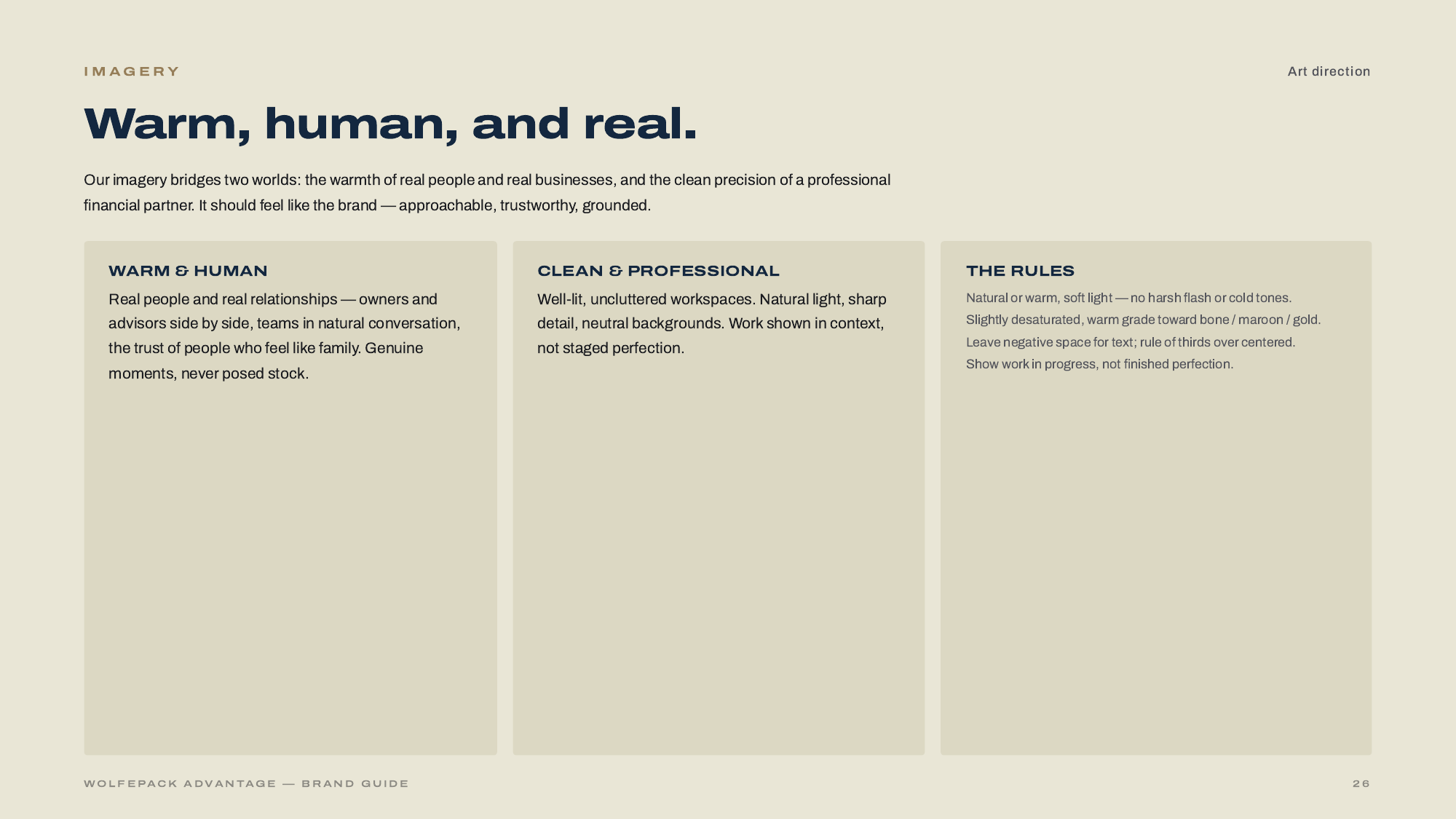
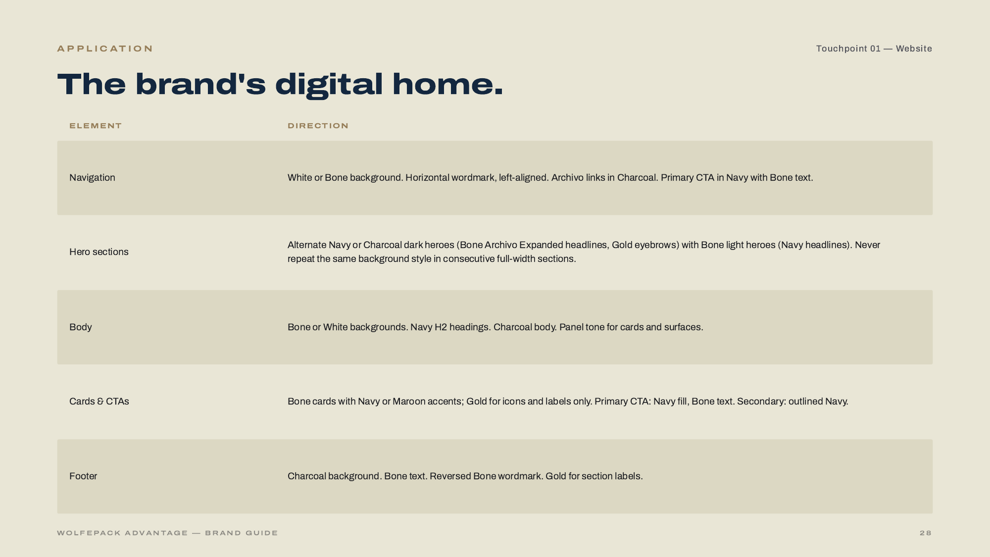
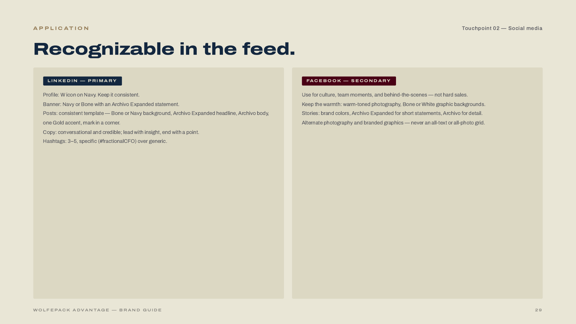
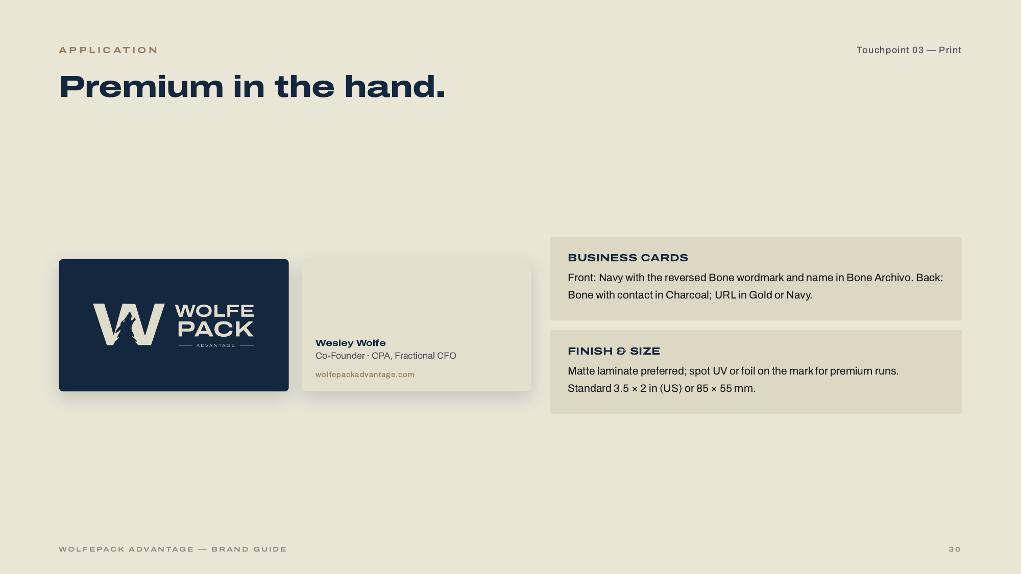
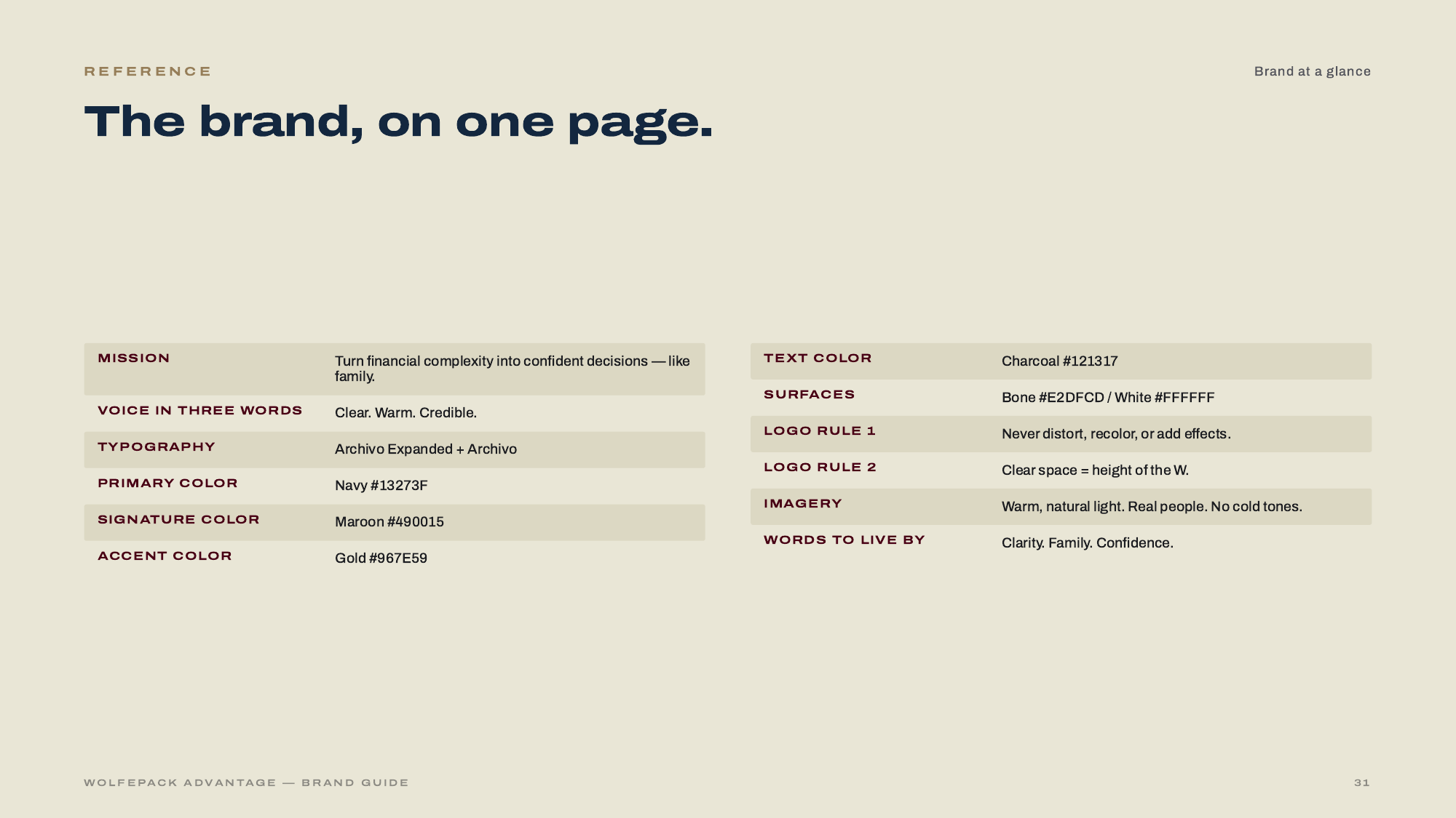
The deck below is the deliverable that goes with the identity: a 32-page brand guide covering the strategy, the mark, colorways, typography, imagery direction, and application across web, print, and social.
What we delivered.
- Brand strategy
- Naming rationale
- Logo & lockup system
- Color & type system
- Voice & vocabulary
- Brand guide (32 pp.)
- Website design
- Website development
- Print applications
The brand in the wild.


Thirty-two pages, one system.
Use arrows, keyboard, or swipe to page through the guide.
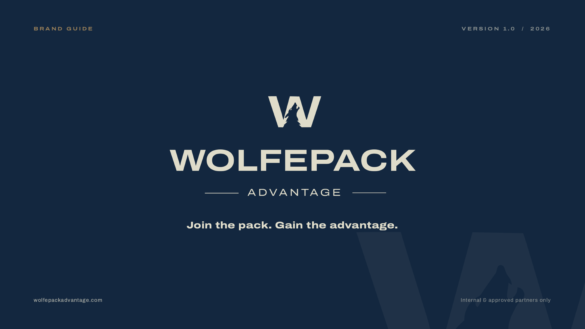
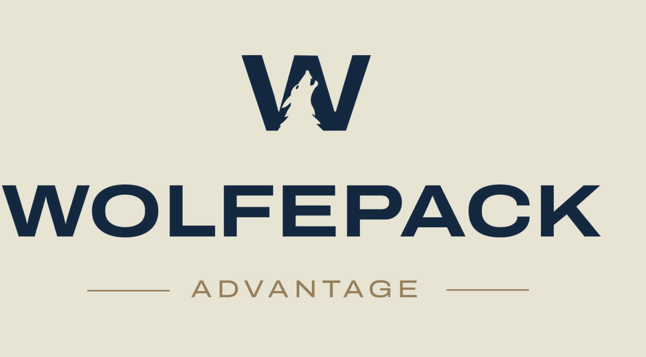
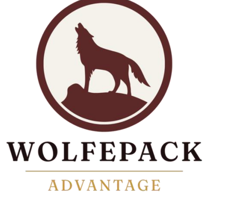
A mark, refined.
From six competing lockups to a single confident stack. Drag the divider to reveal the transformation.
Rebuilt to convert.
Play either clip for a short walk-through of the site as it was and the site as it is now.
Warm.
Human.
Personal.

We are seriously so happy with where this is going. The brand still feels like us, warm, human, and personal, but more elevated all around. You guys really nailed it.
— Zoe Wolfe, Wolfepack