Overview
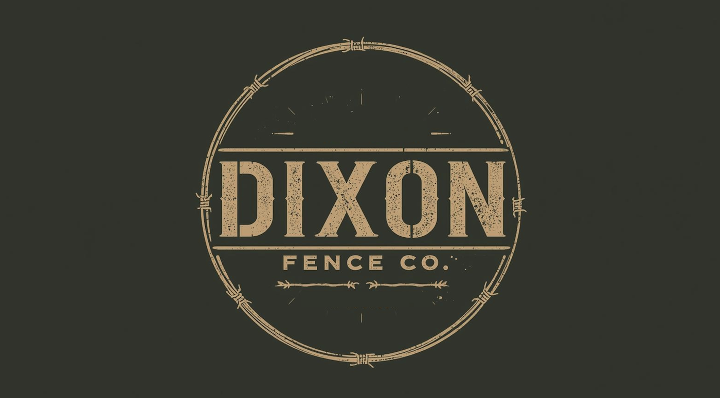
The original Dixon mark carried the business but not the craftsmanship behind it. The new identity trades a generic, dated feel for something that reads as established and trustworthy — cleaner linework, better legibility at a glance, and a mark that holds up equally well on a truck door, a job site sign, or a business card.
The engagement rebuilt a single circular emblem into a full production-ready lockup system: primary DF monogram, DIXON FENCE wordmark, and a barbed-wire divider that ties them together without turning ornamental.
Services
What we delivered.
- Logo redesign
- Lockup system
- Monogram + wordmark
- Production files
Logo
Before / After.
Before
After