Overview
The refreshed Sark Services identity moves from something forgettable to something a customer actually remembers. Tighter typography and a more confident mark give the brand real presence — wherever it shows up, a quote, a van, an invoice, it now looks like a company that knows exactly what it does.
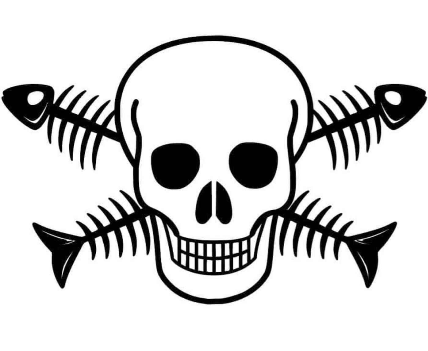
The Gulf-coast character — the fish-and-bones illustration that customers already associated with the business — stays, but is set inside a proper badge with a real hierarchy. The olive-on-black palette holds together as a system rather than a one-off logo.
Services
What we delivered.
- Logo redesign
- Badge system
- Illustration refinement
- Production files
Logo
Before / After.
Before
After